User controls —The simplest form of WPF reusability.
2. Custom Control : Support Templates and themes . Derive from Control class.
width and height from XAML.
Add exisiting controls and provide custom functionality
Refer new user control in your xaml pages.
Custom Control
Create control from the scratch by extending Control class and add custom behavior.
Build to create DLL and reuse it in future projects.
Building a control Library
Take New Project. Select WPF Custom Control Library and name this new project WpfCustomControl
We should point out the following things about the project:
. You don’t get a designer. Yes, custom controls start with code. XAML is still involved, but we’ll approach it differently.
. There’s a Themes folder. In this folder is a file called generic.xaml,
. There’s no app.xaml. This is related to the first and second points.
Reason for creating custom control is to enable control Templates
Think before writing code , what to do :
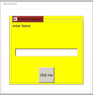
For example, in previous pic checkbox enabled group box
. Two states for all the contained controls: enabled and disabled
. A way to toggle the state
. An indicator of the grouping of the controls.
call the control a ConditionalGroupBox. This name avoids building in expectations of what sort of control will be used to toggle the state.
Take new project -> WPF Custom Control Library
And rename customcontrol1.cs to ConditionalGroupBox.cs.
Observe
……………..
           static ConditionalGroupBox()
                {
         DefaultStyleKeyProperty.OverrideMetadata(typeof(ConditionalGroupBox),
        new FrameworkPropertyMetadata(typeof(ConditionalGroupBox)));
                }
            }
Write the code to create custom control
Create default template for the control using Control Template
UI of custom control is created in generic.xaml.
Testing custom control
To consume custom control in your WPF application, Add reference and add WpfCustomControl library (DLL).
And refer in xaml code:
xmlns:remote=
"clr-namespace:WpfCustomControl;assembly=WpfCustomControl“


…
<remote:ConditionalGroupBox Header="Transmogrify" Margin="20,20,20,20">
<Grid>
</Grid>
</remote:ConditionalGroupBox>
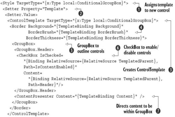
Customising with controlTemplate
<ControlTemplate TargetType="remote:ConditionalGroupBox">
<GroupBox>
<GroupBox.Header>
<ToggleButton
IsChecked=
"{Binding RelativeSource={RelativeSource TemplatedParent},
Path=IsContentEnabled}"
Content="{Binding RelativeSource={RelativeSource TemplatedParent},
Path=Header}" />
</GroupBox.Header>
<ContentPresenter Content="{TemplateBinding Content}" />
</GroupBox>
</ControlTemplate>
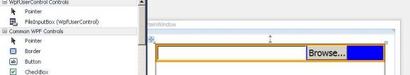
Sample Usercontrol
FileInputBox
DesignerCode for usercontrol
<UserControl x:Class="WpfUserControl.FileInputBox"
  xmlns="http://schemas.microsoft.com/winfx/2006/xaml/presentation"
  xmlns:x="http://schemas.microsoft.com/winfx/2006/xaml"
  xmlns:mc="http://schemas.openxmlformats.org/markup-compatibility/2006"
  xmlns:d="http://schemas.microsoft.com/expression/blend/2008"
  >

    <DockPanel>
       <Button x:Name="theButton"
         DockPanel.Dock="Right" Click="theButton_Click" FontSize="18">
          Browse...</Button>
        <TextBox Name="theTextBox" Width="300" Margin="0,0,2,0"
                     FontSize="18"/>
    </DockPanel>

</UserControl>
CodeBehind for usercontrol
using System;
using System.Collections.Generic;
using System.Linq;
using System.Text;
using System.Windows;
using System.Windows.Controls;
using System.Windows.Data;
using System.Windows.Documents;
using System.Windows.Input;
using System.Windows.Media;
using System.Windows.Media.Imaging;
using System.Windows.Navigation;
using System.Windows.Shapes;


using System.IO;

using Microsoft.Win32;

namespace WpfUserControl
{
    /// <summary>
    /// Interaction logic for FileInputBox.xaml
    /// </summary>
    public partial class FileInputBox : UserControl
    {
       public FileInputBox()
       {
         InitializeComponent();
         theTextBox.TextChanged += new TextChangedEventHandler(OnTextChanged);
       }

         private void theButton_Click(object sender, RoutedEventArgs e)
        {
            OpenFileDialog d = new OpenFileDialog();
             if (d.ShowDialog() == true) //Result could be true,false,or null
            this.FileName = d.FileName;
            }

            public string FileName
            {
                get { return theTextBox.Text; }
                set { theTextBox.Text = value; }
               }


            void OnTextChanged(object sender, TextChangedEventArgs e)
            {
                e.Handled = true;
                if (FileNameChanged != null)
                FileNameChanged(this, EventArgs.Empty);
            }
            public event EventHandler<EventArgs> FileNameChanged;

    }
}
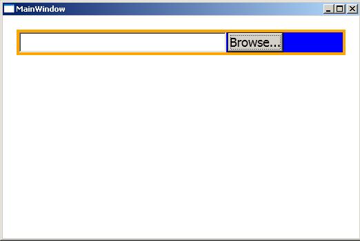
Using FileInputBox in application:
<local: FileInputBox BorderBrush="Orange" BorderThickness="4"
                                Background="Blue"
            HorizontalContentAlignment="Left"/>
Sample Customcontrol
ConditionalGroupBox
DesignerCode for ConditionalGroupBox generic.xaml
<ResourceDictionary
    xmlns="http://schemas.microsoft.com/winfx/2006/xaml/presentation"
    xmlns:x="http://schemas.microsoft.com/winfx/2006/xaml"
    xmlns:local="clr-namespace:WpfCustomControl">
    <Style TargetType="{x:Type local:ConditionalGroupBox}">
        <Setter Property="Template">
            <Setter.Value>
            <ControlTemplate TargetType="{x:Type local:ConditionalGroupBox}">
                    <Border Background="{TemplateBinding Background}"
BorderBrush="{TemplateBinding BorderBrush}"
BorderThickness="{TemplateBinding BorderThickness}">
<Button Background="Brown">
                        <GroupBox>
                      <GroupBox.Header>
                                <CheckBox IsChecked=
"{Binding RelativeSource={RelativeSource TemplatedParent},
Path=IsContentEnabled}"
Content=
"{Binding RelativeSource={RelativeSource TemplatedParent},
Path=Header}"/>
</Button>
                     </GroupBox.Header>
                     <ContentPresenter Content="{TemplateBinding Content}" />
                        </GroupBox>
                    </Border>
                </ControlTemplate>
            </Setter.Value>
        </Setter>
    </Style>
</ResourceDictionary>
CodeBehind for ConditionalGroupBox
public class ConditionalGroupBox : HeaderedContentControl
 {
static ConditionalGroupBox()
 {
     DefaultStyleKeyProperty.OverrideMetadata(typeof(ConditionalGroupBox),
     new FrameworkPropertyMetadata(typeof(ConditionalGroupBox)));
}

 public static readonly DependencyProperty IsContentEnabledProperty =
DependencyProperty.Register("IsContentEnabled",
typeof(bool), typeof(ConditionalGroupBox), new PropertyMetadata(true,new
PropertyChangedCallback(OnIsContentEnabledChanged)));
public bool IsContentEnabled
{
get { return (bool)GetValue(IsContentEnabledProperty); }
set { SetValue(IsContentEnabledProperty, value); }
}

private static void OnIsContentEnabledChanged(DependencyObject sender,
DependencyPropertyChangedEventArgs e)
{
    bool enabled = (bool)e.NewValue;
    ConditionalGroupBox groupBox = (ConditionalGroupBox)sender;
    UIElement content = groupBox.Content as UIElement;
    if (content != null)
        content.IsEnabled = enabled;
}
}
Using ConditionalGroupBox in application:
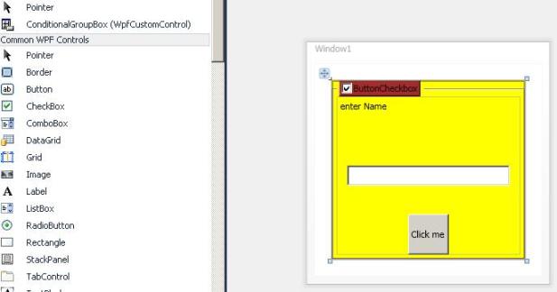
<remote:ConditionalGroupBox Header="ButtonCheckbox" Margin="20,20,20,20"
                                Background="white">